


Welcome to the Bethpage brand.

Bethpage Brand Promise.
Who we are, and what we believe.
Bethpage Federal Credit Union has been serving its members and their communities for over 80 years.
From the time we first opened our doors in 1941, we have kept our promise to continually meet the needs of our members by providing leading products and exceptional service.
We have also maintained our goal of helping our members achieve their dreams of a better life. Caring about what they care about so much that we made it our tagline. And, we are committed to enriching employees’ lives for the same reason – we care about what you care about.®

Vision.
Enriching Lives of our members, employees and communities.

Values.
- Collaborative
- Ethical
- Inclusive
- Innovative
- Respectful
Building Brand Equity.
What makes the Bethpage brand powerful?
A strong brand creates an identity that is universally understood by every consumer that interacts with its products and services. Recognition, consistency, and connection help establish a brand that you can trust.
The Bethpage brand is more than our logo, our colors or our tagline. It is powerful because of the promise it represents and the credibility we have established by living that promise for so many years.
Recognition.
Recognition comes from the way we present ourselves to the public. The physical manifestations of the Bethpage brand translate our message into a visual identity that members internalize and remember.
Consistency.
Members commit to our brand because they know what they’re getting. The Bethpage brand offers unification and clarity, and though the tone might change for the product or audience, the core message remains the same.
Connection.
Our members want to feel like they’re a part of the brand. Through this feeling of connectivity, they can become advocates of our brand. Our vision, mission, and values serve as a mirror in which our members can see themselves.
Bethpage Style.
Bethpage Federal Credit Union has grown from a financial institution that just served a select few, to one that can now welcome members from across the country. Over the years, Bethpage has stayed true to its roots by developing a brand that sets it apart from the big banks and provides a friendly, approachable culture. Vibrant colors, authentic imagery, and content that speaks to our members honestly and clearly.
These elements make up the Bethpage visual language.

Logo.
The first visual point of contact with our brand.
Our logo represents our difference from the big banks. It is simple in form, but rich in symbolism. The 'heart of Bethpage' represents how we care about enriching the lives of our members, community, and employees.
Primary logo.
Can be used with or without tagline.
Secondary logo.
To be used sparingly, only when necessary.
DOWNLOAD PNG
DOWNLOAD EPS
Solo "B-Heart".
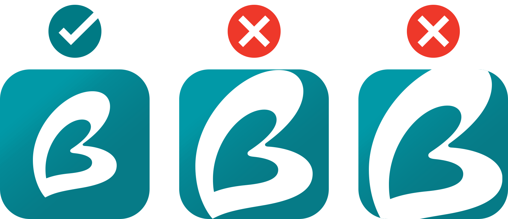
This graphic should be used sparingly independent from the primary logo - in areas such as social media badges and mobile app icons. When used, the appropriate padding should be given to the B-Heart to ensure legibility.
"B-Heart" alignment.

The correct logo treatment features the heart aligned to the descender of "Bethpage."
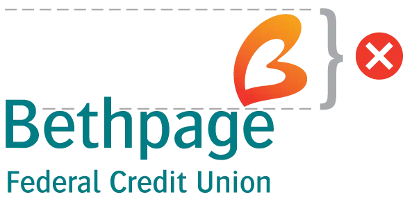
This incorrect treatment features the heart above the typography.

This incorrect treatment features the heart centered to the lettering.
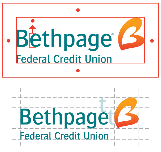
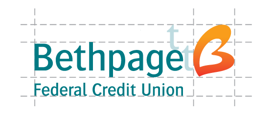
Padding and spacing.
The intent of padding around the logo is to not crowd the logo and give it room to breathe.
The isolation area, or protected zone, is determined by the height of the “e” in “Bethpage”. To preserve the readability of the logo, this area around the logo must not contain any other design elements.
Placement of the “B-Heart” in relation to “Bethpage” and “Federal Credit Union”, should always be LOCKED. Spacing between the “B-Heart” and the “e” in Bethpage is approximately the width of the “t” in Bethpage.
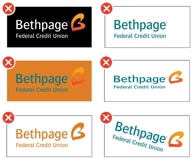
The dos and don'ts.
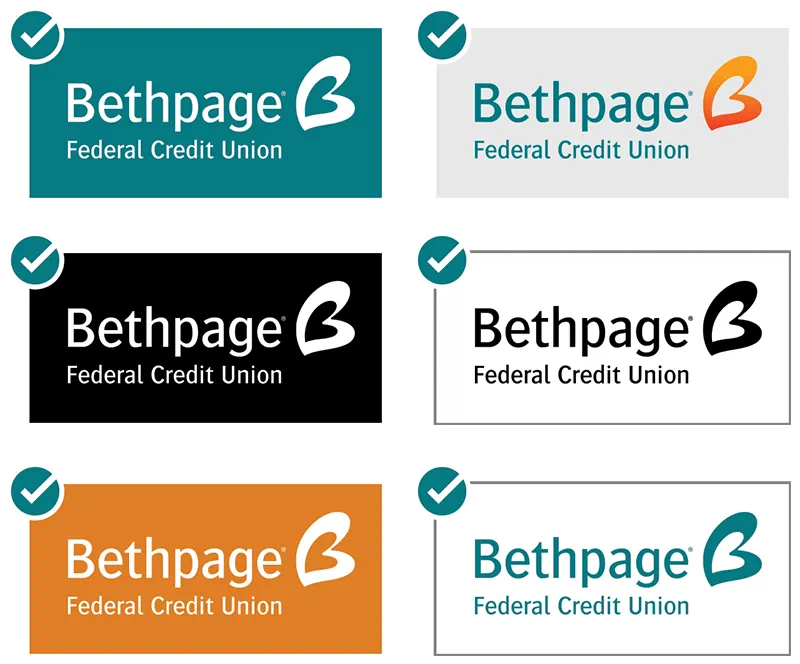
Bethpage business group logos.
Padding and spacing.
The intent of padding around the logo is to not crowd the logo and give it room to breathe.
The isolation area, or protected zone, and is determined by the height of the “e” in “Bethpage”. To preserve the readability of the logo, this area around the logo must not contain any other design elements.

Placement of the “B-Heart” in relation to “Bethpage” and “Federal Credit Union”, should always be LOCKED. Spacing between the “B-Heart” and the “e” in Bethpage is approximately the width of the “t” in Bethpage.
The dos and don'ts.
Bethpage business group logos.
Colors.
Standing out from the rest.
The Bethpage color palette is unique in our industry, helping to convey our goal of being a caring, down-to-earth, community-oriented financial institution.

CMYK 100 6 35 32
RGB 0 121 131
Pantone 322

CMYK 0 63 91 0
RGB 244 125 48
Pantone 165

CMYK 0 93 95 0
RGB 238 45 36
Pantone 485

CMYK 75 9 27 0
RGB 7 173 187
Pantone 7710

CMYK 0 45 100 0
RGB 249 157 28
Pantone 137

Radial Gradient
Visibility 30%
Use only for backgrounds

CMYK 0 45 100 0 (80% Screen)
RGB 249 157 28 (80% Screen)
Pantone 137 (80% Screen)
Use only for type on teal backgrounds

CMYK 70 60 59 43
RGB 68 68 68
The digital color palette is designed to provide an online experience that reinforces the strength of the Bethpage brand. Tones of the teal and orange colors are anchored with a predominant use of white and tones of gray across our website to provide consistency and a clear hierarchical structure for our navigational elements, banners and page content.
Web #007983
RGB 0 121 131
Web #07ADBB
RGB 7 173 187

Web #AAAAAA
RGB 170 170 170
Web #F99D1C
RGB 249 157 28
Web #444444
RGB 68 68 68

Web #F5F5F5
RGB 245 245 245
Web #E07C02
RGB 224 124 2

Web #666666
RGB 102 102 102
Typography.
Getting the message across.
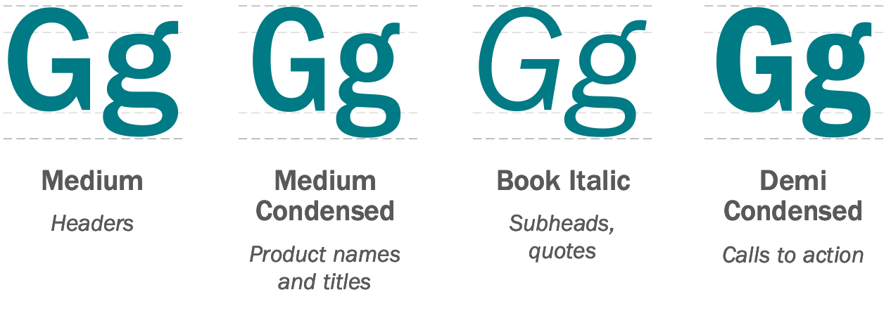
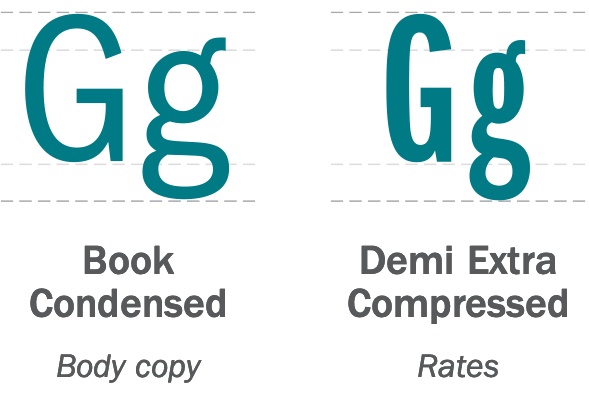
Our simple and clean typography plays an important role in the look of our brand. ITC Franklin Gothic Std is our font family. We use variations of this font’s weights in all of our member-facing marketing collateral, and it should be used in as many internal communications as possible.
Libre Franklin and Arial are used on the website and in digital marketing due to their more universal compatibility.
ITC Franklin Gothic Std

Libre Franklin

Arial

Typography.
Getting the message across.
Our simple and clean typography plays an important role in the look of our brand. ITC Franklin Gothic Std is our font family. We use variations of this font’s weights in all of our member-facing marketing collateral, and it should be used in all internal communications, as well. Due to their more universal compatibility, Franklin Gothic URW and Arial are used on the web and in email marketing.
ITC Franklin Gothic Std
Libre Franklin


Arial

Photography.
Putting faces to the name.
Real Bethpage employees provide a friendly and trustworthy face for our brand – strengthening the personal connection.
Employee images should be used whenever possible and should help tell the story of the product or service they are paired with. Lifestyle, device and product photography can also be utilized for certain products and services, most often on the website or social media. These images can be featured on solid backgrounds, with a brand color overlay, or in member-facing environments, such as a branch.


Iconography.
Simplifying the message.
Vector icons bring a clean and modern look to the brand - reinforcing the product or service without overpowering the message.
We have icons to match every product and suit every need. These graphics are minimalistic, always single color, and can be used with varying levels of transparency. Our iconography can be utilized as a primary design element, or as a secondary background element, depending on the channel and need. See marketing examples below for reference.
DOWNLOADIconography.
Simplifying the message.
Vector icons bring a clean and modern look to the brand - reinforcing the product or service without overpowering the message.
We have icons to match every product and suit every need. These graphics are minimalistic, always single color, and can be used with varying levels of transparency. Our iconography can be utilized as a primary design element, or as a secondary background element, depending on the channel and need. See marketing examples below for reference.
DOWNLOAD